What Is Energy Domain Data? A Practical Walkthrough of How Users Actually Work in the Platform
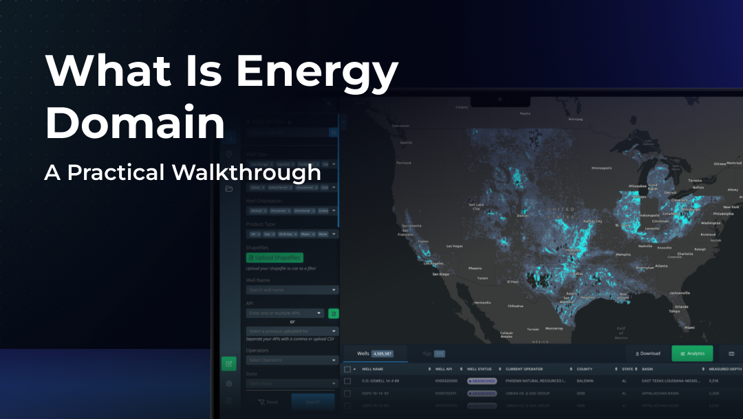
Energy Domain Data is an upstream oil & gas data platform built around a simple premise: most technical teams think spatially first, filter aggressively, and only then move into analysis. The application is designed to support that natural flow without forcing users into rigid dashboards, predefined reports, or unnecessary abstraction.
This walkthrough focuses on how users interact with Energy Domain day to day, what happens after login, how information is explored, and why teams rely on it as part of their regular workflow.
The First Interaction: Starting With the Map
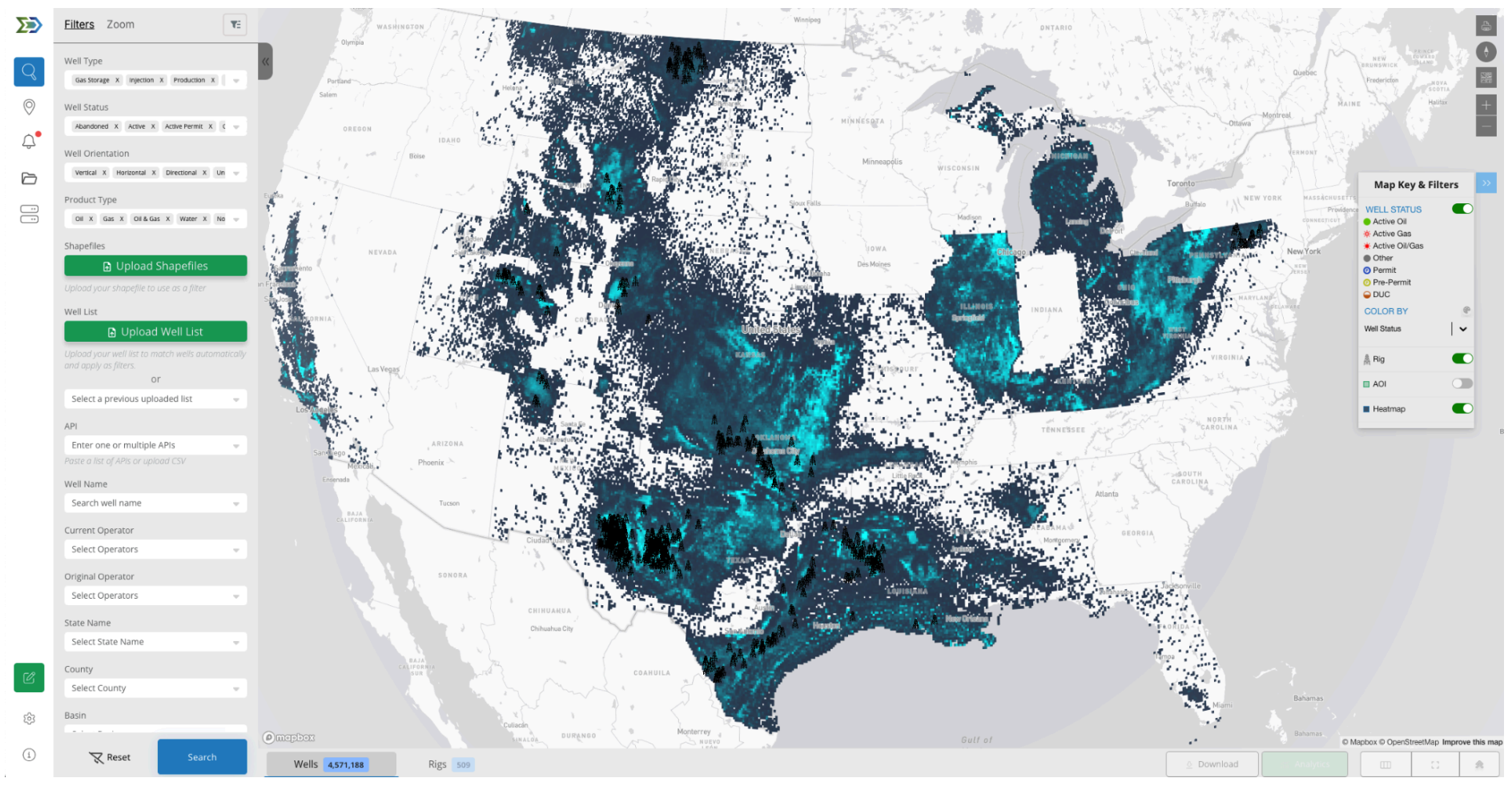
When a user logs into Energy Domain, they are placed directly into a live map view. There is no onboarding wizard or predefined dashboard. The expectation is that users already know what they are looking for geographically, whether that is a county, a lease block, or a basin trend.
From the outset, the platform encourages exploration. Users zoom, pan, and orient themselves spatially before doing anything else. This mirrors how most upstream decisions begin: by asking where activity is occurring and how it relates to existing positions or interests.
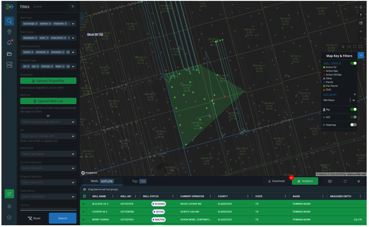
Filtering as the Primary Method of Analysis

In Energy Domain, filtering is not a secondary feature, it is the core interaction model. Users do not “run reports.” Instead, they progressively narrow the dataset until it reflects exactly the slice of activity they care about.
As filters are applied, the map updates immediately. Wells appear or disappear, rigs shift into focus, and the data table adjusts in real time. This tight coupling between spatial view and tabular output allows users to validate their assumptions visually without exporting data or second-guessing results.
The practical outcome is speed. Analysts move from broad screening to targeted evaluation in minutes, not hours.
Moving From Map Context to Well-Level Detail
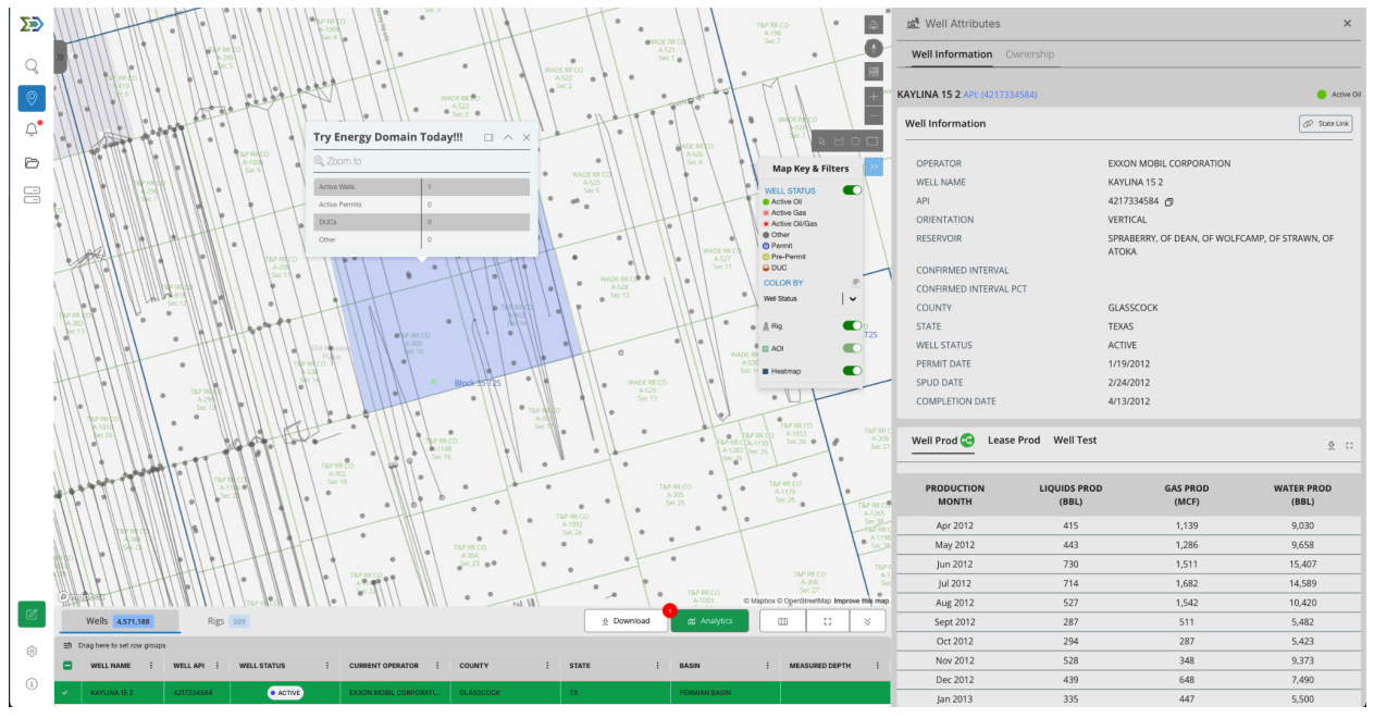
Clicking into a well is intentionally lightweight. Instead of opening a new page or forcing deep navigation, Energy Domain presents well information in a side panel that keeps users anchored to the map.
Users review basic header data, production history, and ownership information quickly, then move on. This interaction pattern supports rapid comparison across offsets and minimizes the friction that typically slows down basin or asset reviews.
The design assumes users want answers, not exhaustive documentation.
Where the Work Gets Done: The Data Table
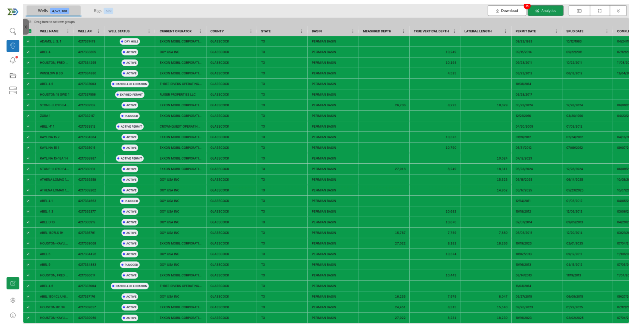
Once users have narrowed their view spatially, the data table becomes the primary workspace. This is where screening turns into analysis.
The table always reflects what is selected on the map. Users sort, group, and reorganize columns to answer specific questions, then adjust filters again if something looks off. There is no disconnect between what is being analyzed and where it exists geographically.
This replaces a common workaround in upstream teams: exporting raw data simply to understand whether a query was correct.
Areas of Interest: From Exploration to Monitoring
Most teams eventually expand their use of Energy Domain, taking it from a research tool to a proactive monitoring system. Areas of Interest (AOIs) are the turning point.
Users define AOIs around acreage, competitors, or development corridors. Once saved, those AOIs persist and generate alerts as activity changes. Instead of repeatedly checking the same areas, users are notified when something meaningful happens.
This is particularly valuable for lean teams that need awareness without constant manual review.
—-
If you want to understand Energy Domain, the fastest way is to use it.
Start a free 7- day trial and work through one real workflow, an area you know well, a question you’ve had to answer recently, or a region you actively monitor. You’ll know quickly whether the interaction model fits how your team operates.
👉 Start a free trial or request a walkthrough at energydomain.com/data